The Funding Agency - A More Considered Approach to Finance
TFA began with a simple idea: to remove the complexity from finance and lending, replacing jargon with clarity and generic solutions with tailored strategies. As the brand grew, so did the calibre of its clientele - entrepreneurs, seasoned investors, and high-income individuals seeking a more sophisticated, relationship-driven service.
To honour that growth, TFA needed a brand that reflected its evolution: elevated, polished, and confident, without losing its human touch.
Repositioning the narrative
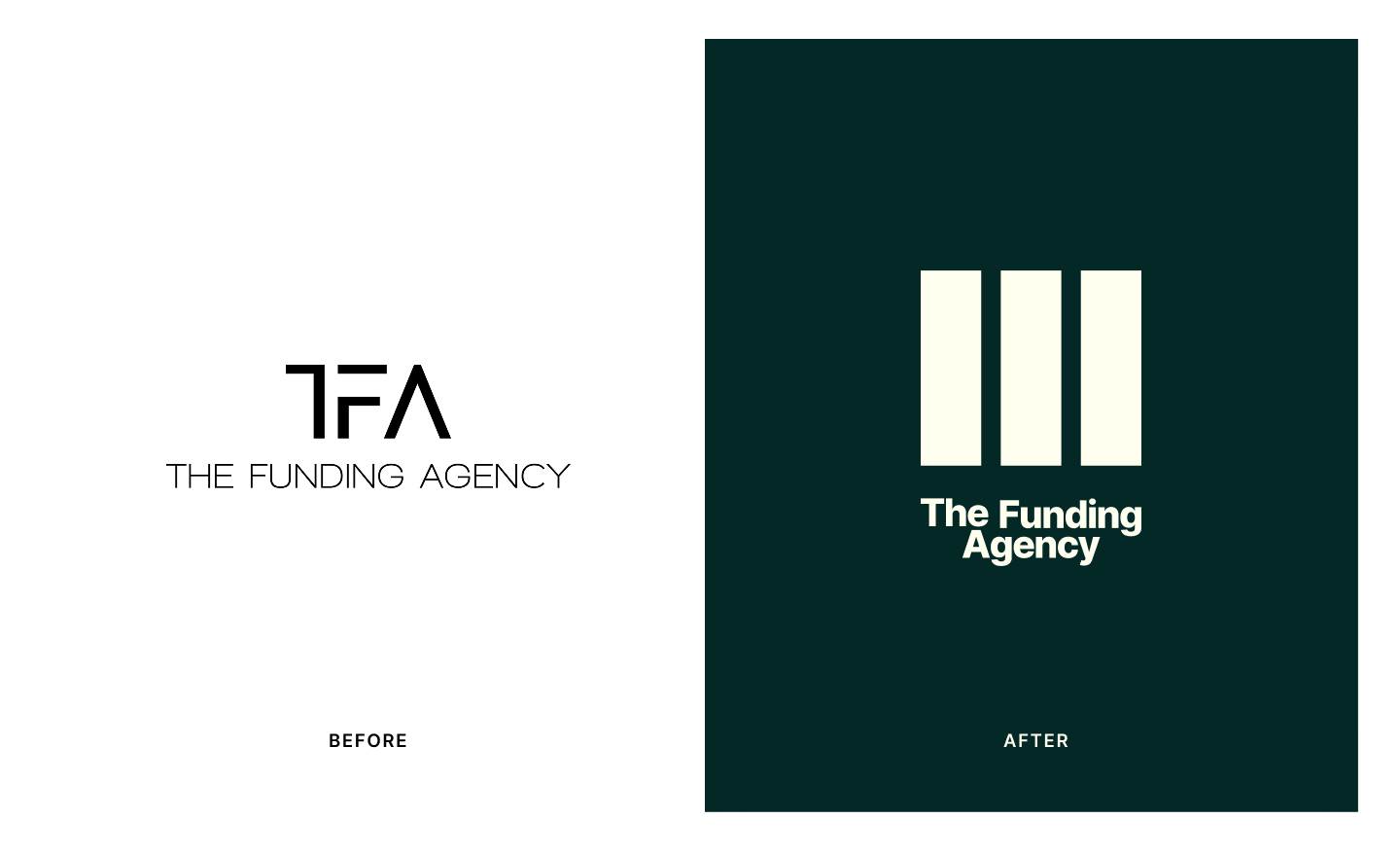
We started by redefining how TFA shows up in the world. No longer just a broker — TFA is now a trusted partner, a quiet advisor behind confident financial decisions.
We built a new visual and tonal identity rooted in simplicity, space, and substance. Clean lines, neutral tones, and a voice that educates without ego. The goal wasn’t to be loud - it was to be lasting.
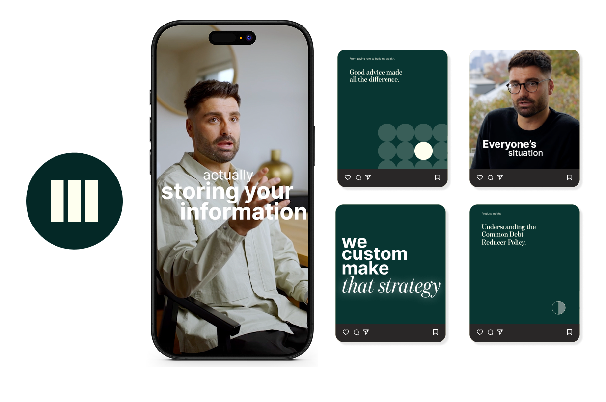
Every touchpoint from web presence to social content was reimagined to feel editorial, intentional, and precise.

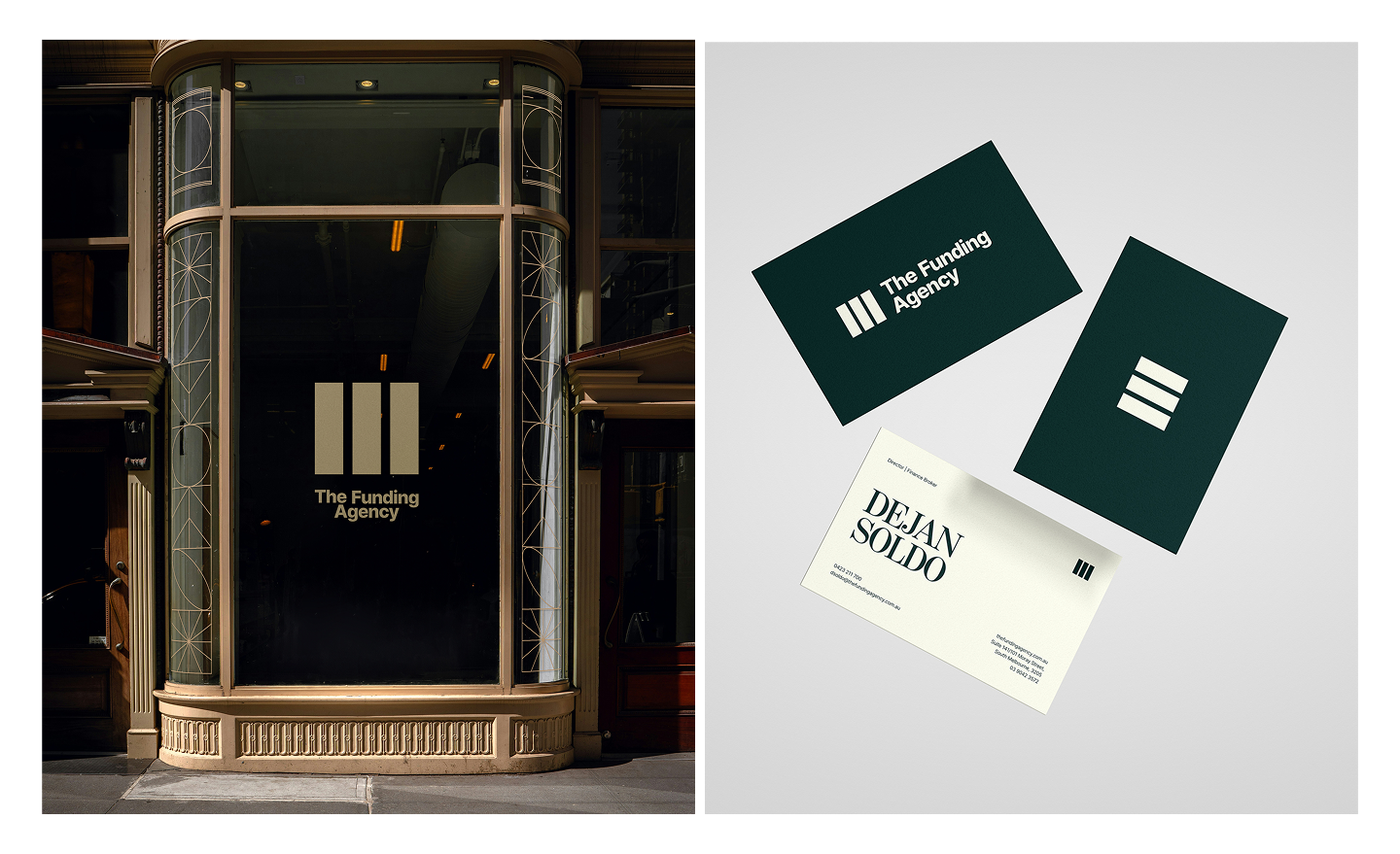
Subtle Signals, Powerful Impact
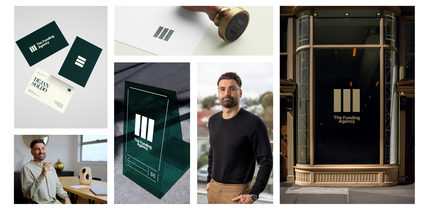
Every element of the rebrand was designed with restraint. We introduced a new logomark — minimalist, confident, and modern. Paired with timeless serif and sans-serif typography, and a refined colour palette rooted in slate, stone, and ink.
Photography moved away from stock imagery, focusing instead on candid moments: a handwritten signature on a loan agreement, the quiet concentration of a business owner, the natural light in a well-appointed home office.
The cumulative effect is a brand that whispers luxury, rather than shouting for attention.