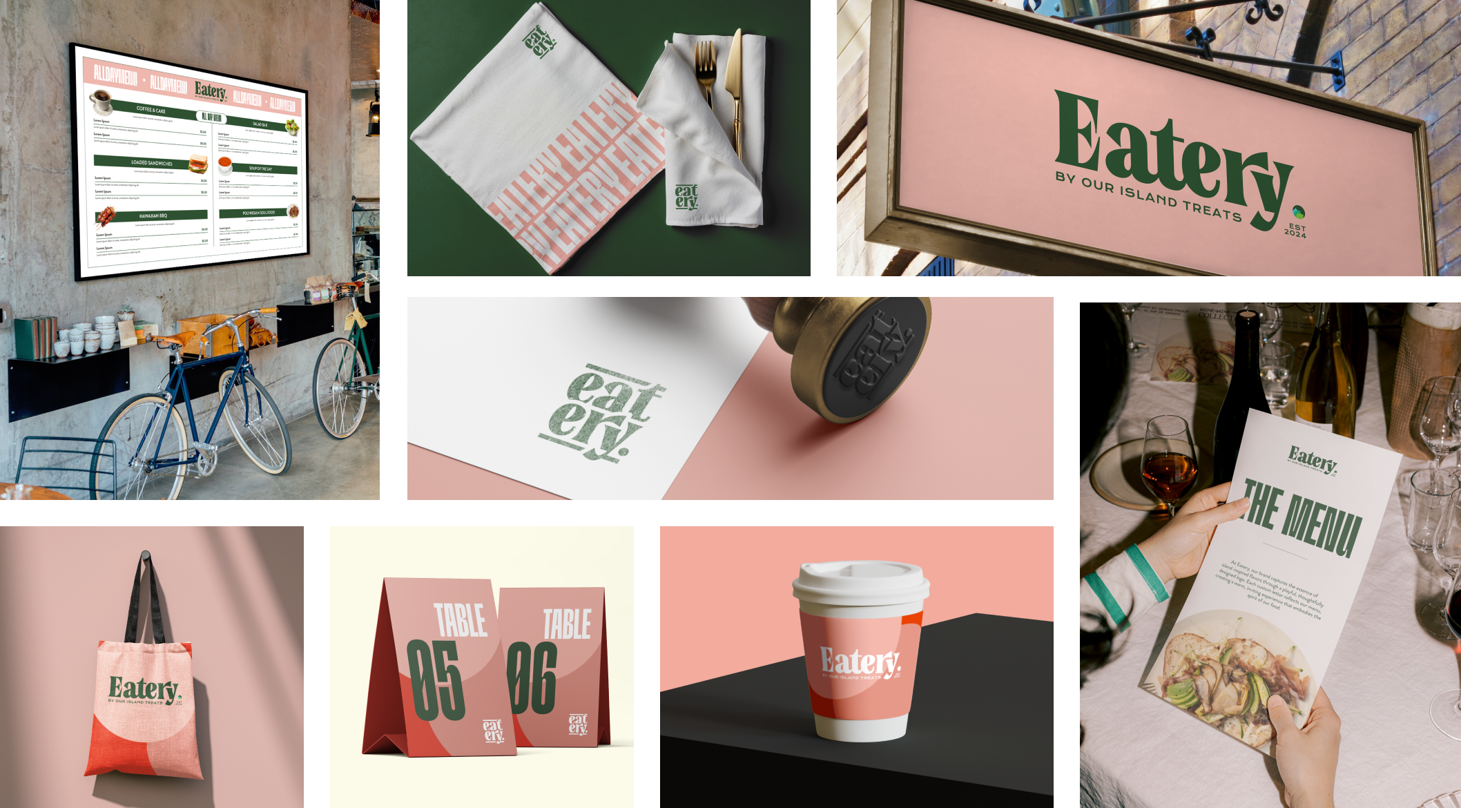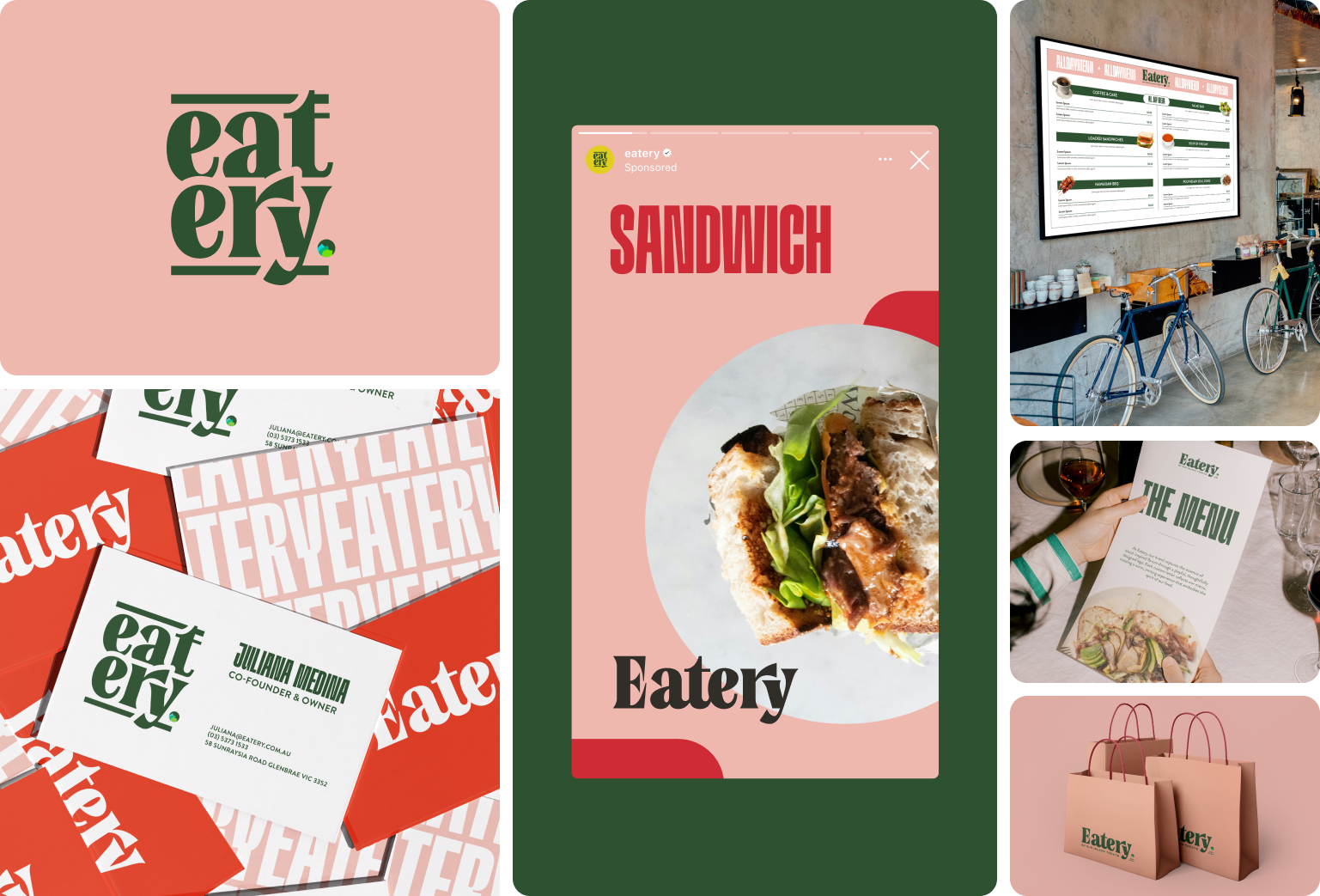
Eatery — Island Flavour, Elevated
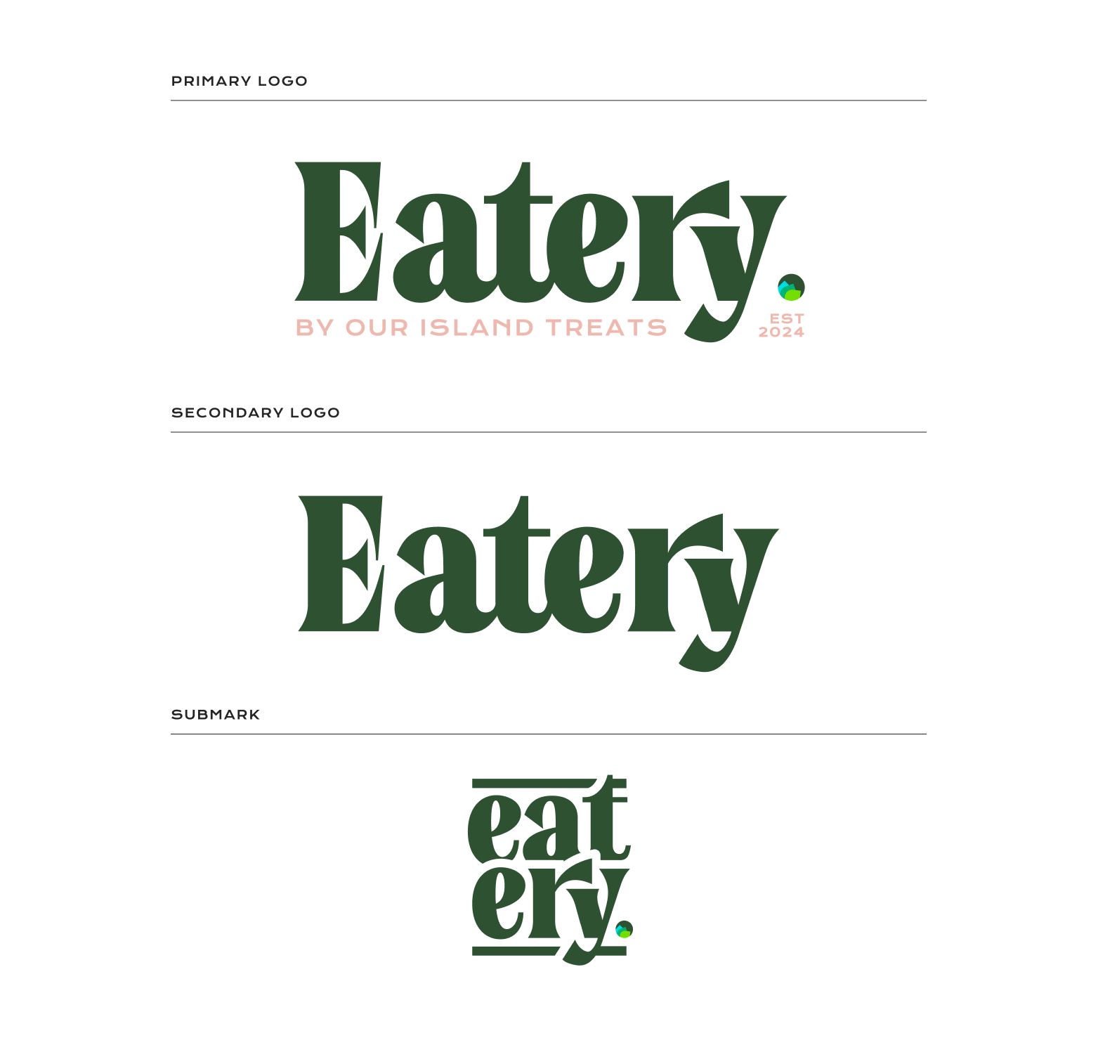
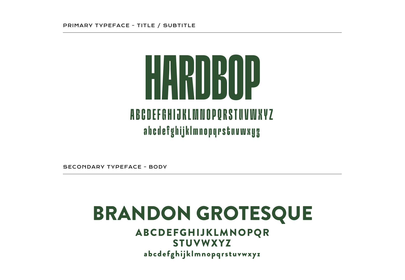
Eatery is a refined dining concept rooted in island flavours and inspired by its parent brand, Our Island Treats. My goal was to create a brand identity that felt both fresh and connected, elevating the visual language while maintaining a sense of familiarity. The primary logo incorporates a subtle mark from Our Island Treats and features a signature “by Our Island Treats” tagline to reinforce the brand's lineage. Supporting logos, including a clean wordmark and a minimal submark, offer flexibility across various applications.
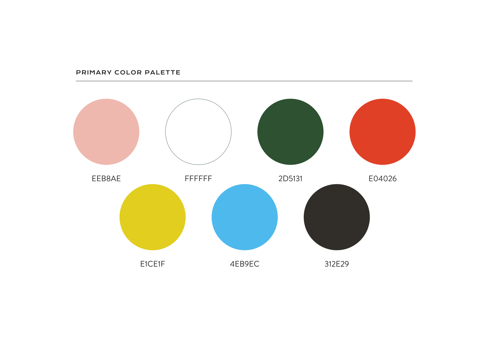
I crafted a vibrant yet sophisticated colour palette, led by a soft pink and grounded with white and deep green, balanced with pops of red, yellow, and blue to reflect Eatery’s energetic, flavour-forward personality.
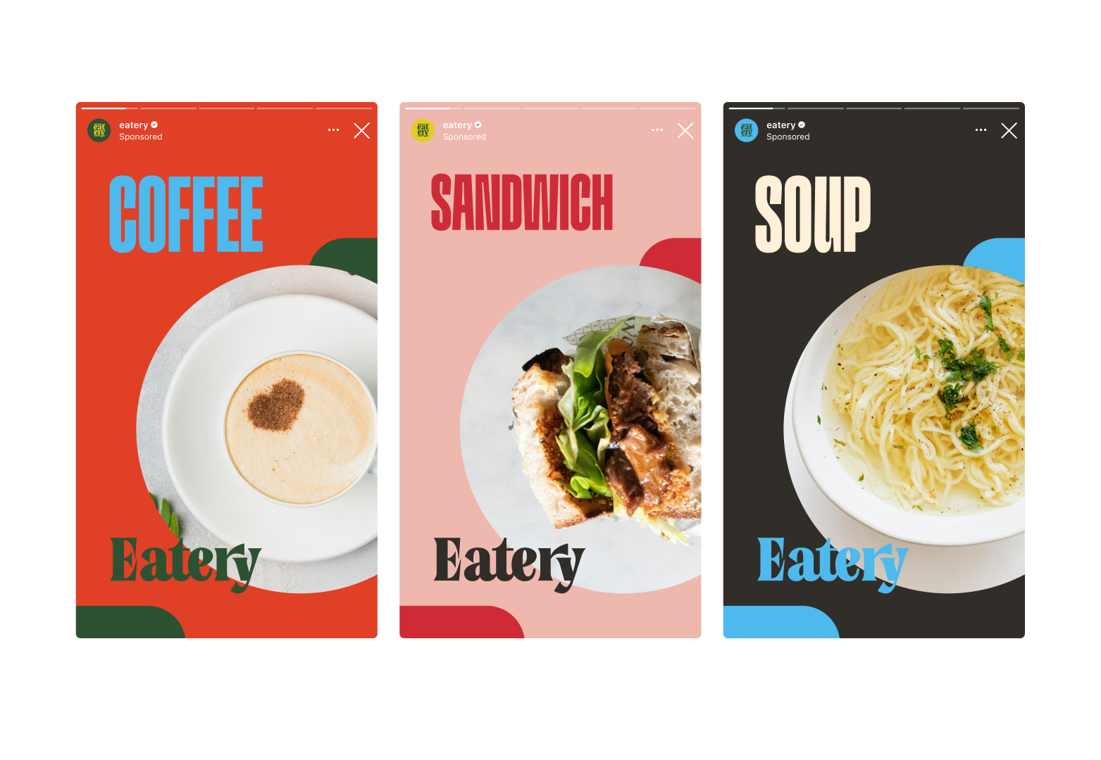
To bring the brand to life, I developed a range of mockups - from menus and signage to coffee cups and tote bags - each showcasing how the visual identity scales across touchpoints. The result is a cohesive, contemporary brand system that captures the warmth and elevated experience of Eatery.
Delivered: Brand Identity · Logo Suite · Colour + Typography System · Visual Mockups · Brand Application Design